Solution: Introducing Mosaic
Pairing an inclusive, interactive, customizable
retail shopping experience.
With intuitive kits that teach you how to sew your own bespoke clothing.
Hover on me!
Hover on me!
Concept Video
Project Details

Role

UI Design Lead

User Researcher

Team Size

4

Duration

10 Weeks

Tools

Figma

Framer

Maze Testing
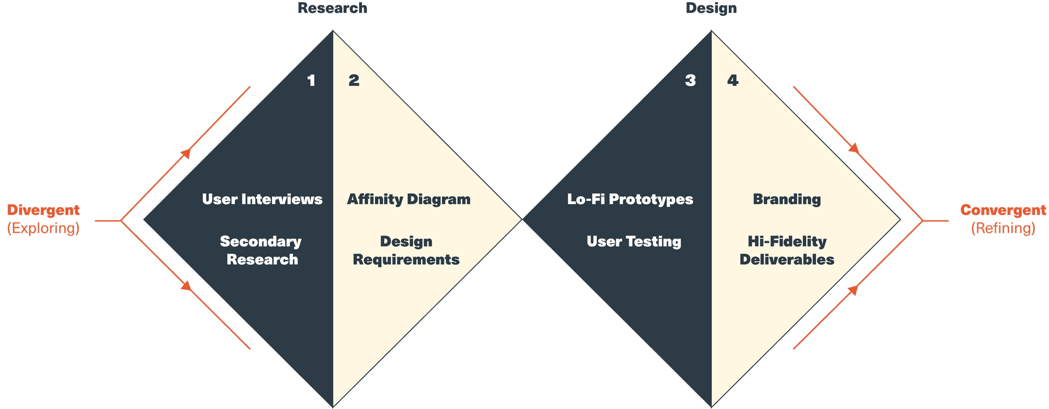
User research: Our users and the questions we had for them

Creators

One of our goals with Mosaic was to reimagine bespoke fashion to be more sustainable, inclusive and accessible. Since bespoke fashion starts from its creators, we targeted fashion designers, artists and social media influencers to be our primary users who would in turn, drive our vision and bring it to fruition. Our user research was centered around understanding their creative process by asking the following questions:


What kinds of garments are they interested in creating?

Where do they find success in their creative endeavors?

Where do they struggle in their creative projects?

Gen-Z Fashion Consumers

These people are today’s younger generation, from elementary school students to college students. A powerful voice in the world for environmental change, social justice, and other progressive issues, this generation is a native of social media platforms and is likely to follow the early-adopting creators. We should discover what their current preferences and clothing shopping habits are.

What’s important to them in a garment?

What is mainstream retail not providing to them?

What are their turn-offs for online shopping?

Methods: How we got our answers
Why Semi Structured Interviews?
As our primary method of research, we decided to use semi-structured interviews with a few key participants. The participants were recruited through our personal networks as well as through cold contacts with certain user groups on the Clubhouse App and Instagram. All team members had to recruit atleast one participant.

These interviews allowed us to discuss the problem space in detail with experts and ask follow up questions where necessary for further elaboration.
The interviews were loosely structured around 6 or 7 questions from the above themes and tailored to each participant. They were also recorded and transcribed with consent.

We felt that the flexible and thorough nature of conversational interviews allowed us to get more detailed insights on our problem space in comparison to other methods such as discovery surveys or observational studies.

Meet the Participants
P1 - An Instagram Creator who has an animated character line and experience creating her own customized line of t-shirts.
P2 - An Instagram Creator who creates a variety of outdoors-related designs. She hasn’t yet created a custom clothing line, but has taken time to explore the differ-ent options available.
P3 - A graphic and letterform designer who wants to place 2D patterns onto clothing and eventually create their own fashion designs from scratch.
P4 - A member of the LGBTQIA community with an interest in DIY Projects.
P5 - A member of the LGBTQIA community with an interest in DIY Projects.

P6 - A Gen Z novice sewer and creator.
P7 - A fashion designer based in New York with their own online clothing line.
Analysis: Making sense of the data
Why an Affinity Diagram?
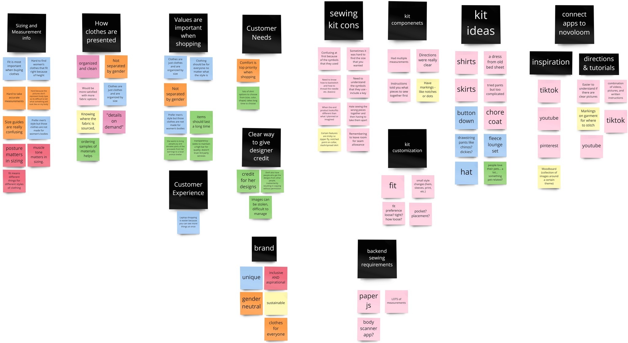
An affinity diagram was key in bringing together each team member’s interview learnings an identify commonalities and patterns. The diagramming process forced each team member to reflect critically on the interviews they conducted, to learn about each others’ interviews, and to form human-centered stories based on the themes. The creation of human stories and their corresponding themes was important, promoting the building of empathy and designing solutions with peoples’ needs at the core. The learnings directly informed the creation of our design requirements.

Diagramming Process
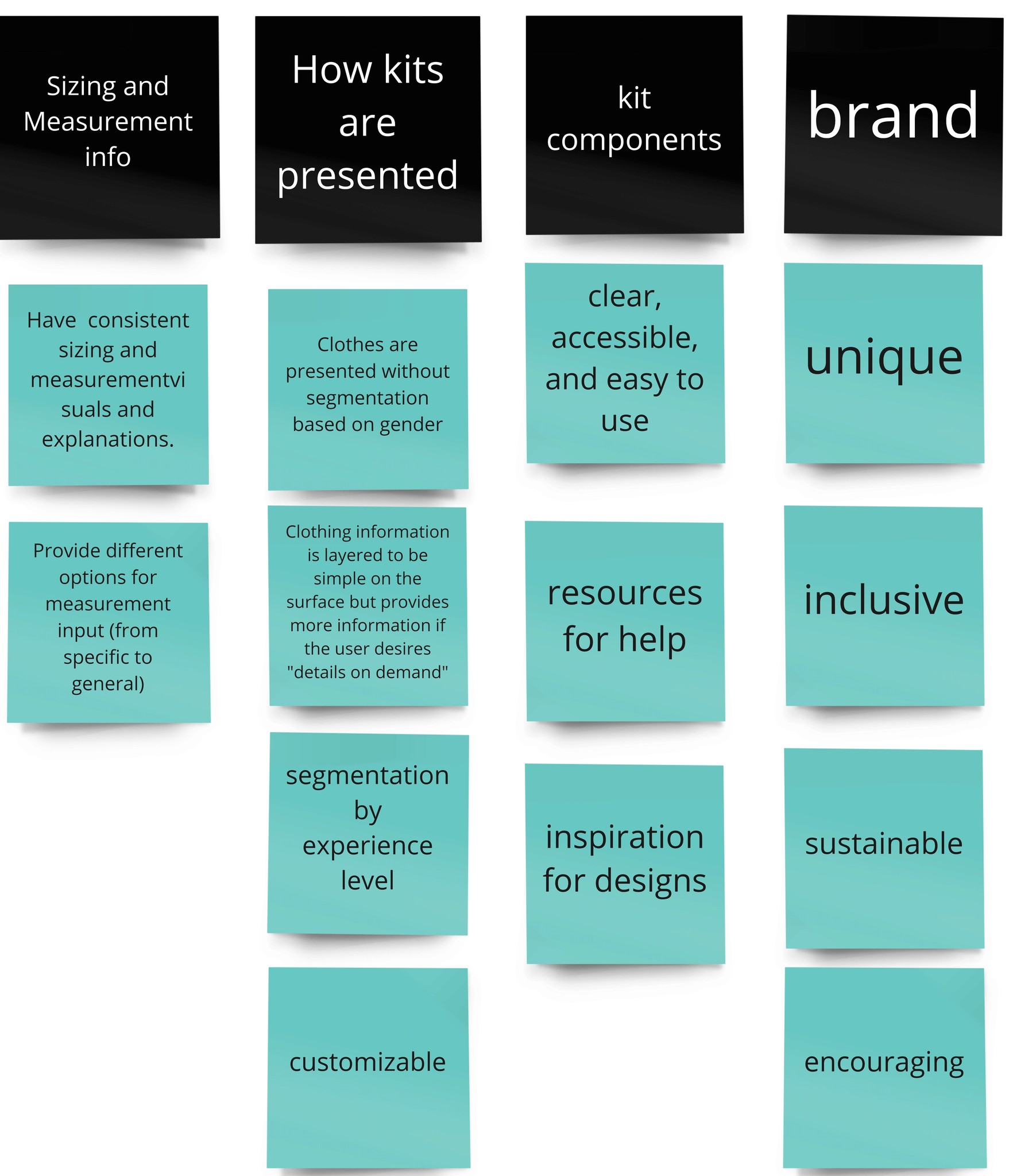
After completing the interviews and secondary research, the team created an affinity diagram on Miro. Team members prepared for the diagramming session by first pooling their notes into a shared document. Sticky notes were then created for each interview conducted by that team member and added to the Miro board. The sticky notes were then grouped into emerging themes and insights and then regrouped into a set of design requirements.
(The final two stages are included below. Link to full board)
Why DIY?
After reviewing our research we took decided to pursue a solution that was targeted towards DIY enthusiasts. We felt that DIY products not only solved our initial design problem by way of the IKEA effect but also served an untapped market in the context of the pandemic.
The IKEA Effect:
We place disproportionately high value on things we helped to create.
The IKEA effect describes how any people see their own creations in a different lens. When we put our own labor into creating something for ourselves we place more intrinsic value on it. When it comes to an article of clothing we value it more, are more likely to keep using it and pass it down. Longevity and reusability help making DIY clothing more sustainable.

The Pandemic:

“The last year has seen an up-tick in interest for traditional crafting activities like sewing, quilting, knitting and crocheting. ” - Mintel- Jan 2021

Sewing is cool again: the popularity of “sewing influencers” spiked on YouTube and TikTok during the COVID-19 pandemic. Micarah Tewers (above) gained 354K subscribers in March 2020 alone. She re-creates famous outfits while narrating the process. She’s hilarious and aspirational, but her fast-paced, chaotic style makes her process hard for her viewers to replicate.
Sources:
1 - Norton, M. I., Mochon, D., & Ariely, D. (2012). The IKEA effect: When labor leads to love. Journal of Consumer Psychology, 22(3), 453-460. https://doi.org/10.1016/j.jcps.2011.08.002

2 - Marsh, L. E., Kanngiesser, P., & Hood, B. (2018). When and how does labour lead to love? The ontogeny and mechanisms of the IKEA effect. Cognition, 170, 245-253. https://doi.org/10.1016/j.cognition.2017.10.012

3 - Dumont, J. (2020, June 5). Meal kit industry expected to hit $20B by 2027. Grocery Dive. https://www.grocerydive.com/news/meal-kit-industry-expected-to-hit-20b-by-2027/579265/
Design Requirements: Our design principles and where they came from.
R1
Take a variety of approaches to sizing
Why?
R2
No Gender, No Body Type
Why?
R3
Enable and encourage customization of kits to align with style choices
Why?
R4
Provide a variety of guided experiences that teach and inspire users to DIY.
Why?
R5
Present a brand that is unique, inclusive, sustainable, and encouraging to all
Why?
Information Architecture: Mapping out the flow of our retail website.

Main Flow

Secondary Flows

Why create an IA diagram?
Our design requirements informed what information and features would need to be included in the website. Once identified, each section of information and individual features needed to be linked to a page for the user to see, and then the relationships between each page needed to be established. The IA Diagram answers questions like, “how should a user navigate between pages,” “how should a page be labelled,” and “what should come next?” From the user’s perspective, it tries to create an experience where the right amount of information is presented to the user at the right time. From the development team’s perspective, it informs what wireframes must be created for the low-fidelity prototypes so that the hypothesized features and user flow can be tested in later stages.
Lo-fidelity Prototypes: A proof of concept
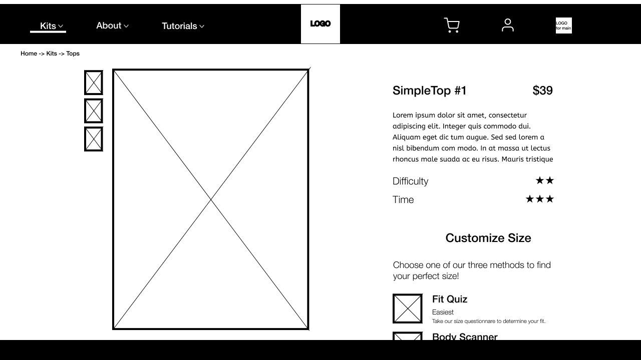
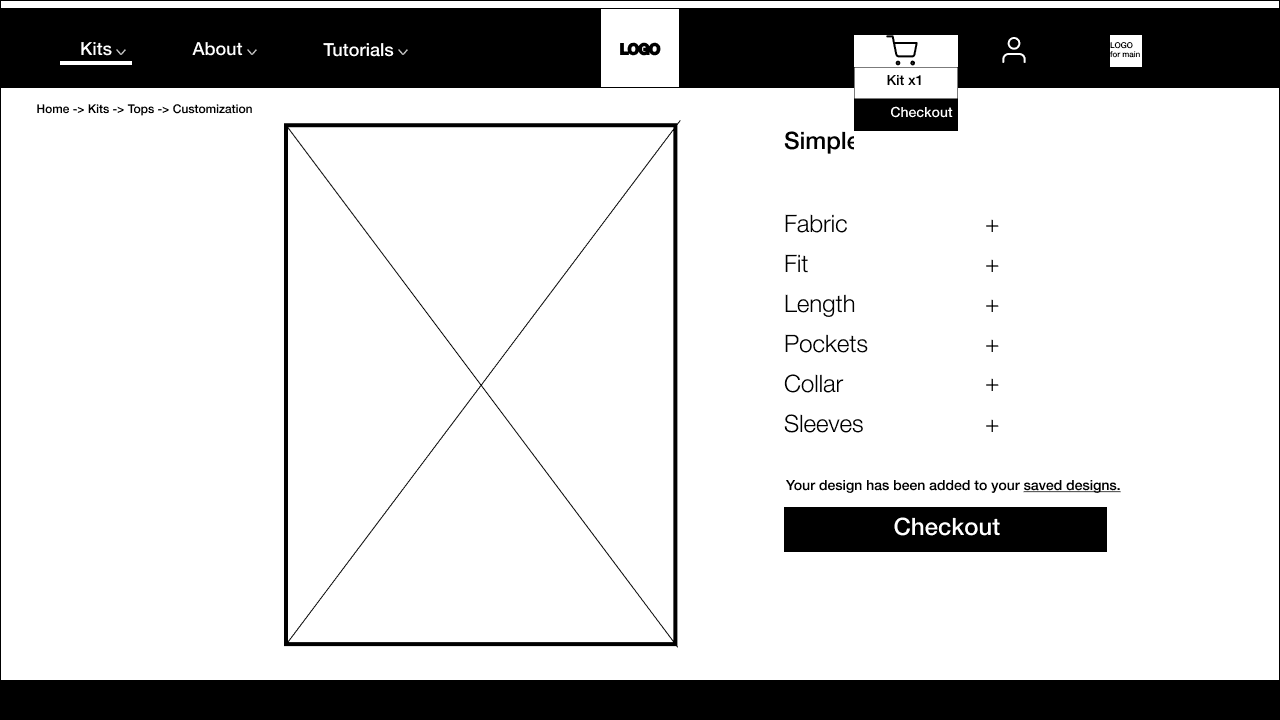
Wireframes
Why?
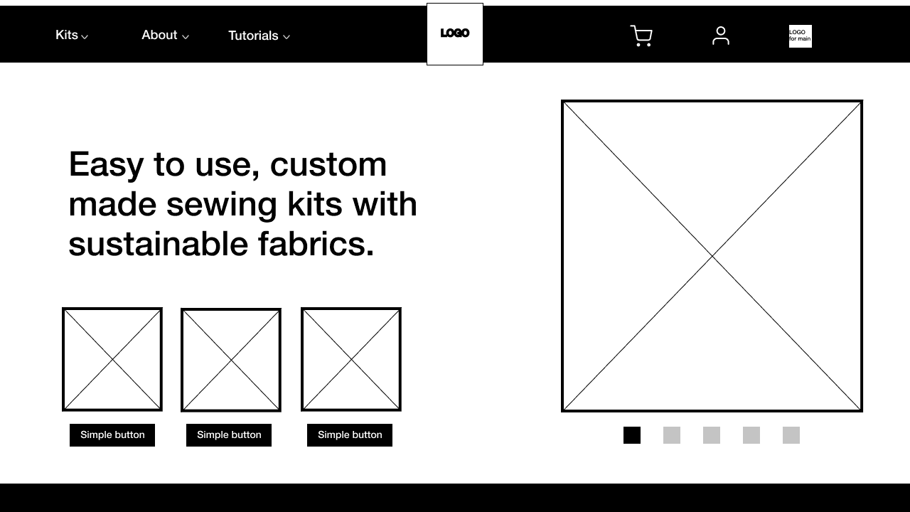
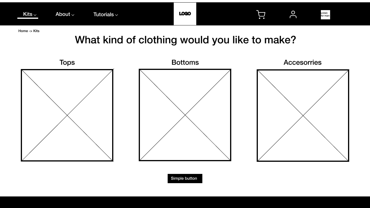
Wireframes serve as the skeleton of our digital product. In order to take an iterative approach to building our platform, it was important for us to establish the basic structure of our website through wireframing. We can then test this structure before carrying the design further. Thus, we wanted to finish our wireframes and be ready for our next milestone which involves user testing and iteration. This way, any structural changes that need to be made after testing can be incorporated easily before moving to a higher fidelity iteration.
Physical Kit Prototype
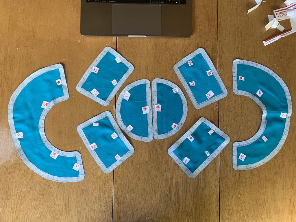
To test the concept of our sewing kits, our DIY savvy team members reverse engineered a simple piece of clothing. The bucket hat. It featured a system of symbols for knowing which ends to sew together as well as a set of instructions and diagrams for the user to follow. Our overarching design goals were :

1) to create a seamless transition from the digital to physical experience.

2) to allow a novice sewing enthusiast to assemble a simple custom garment without significant obstacles

3) make the kits and DIY experience enjoyable, educational, and marketable.

This prototype was internally tested and then given to 3 participants.
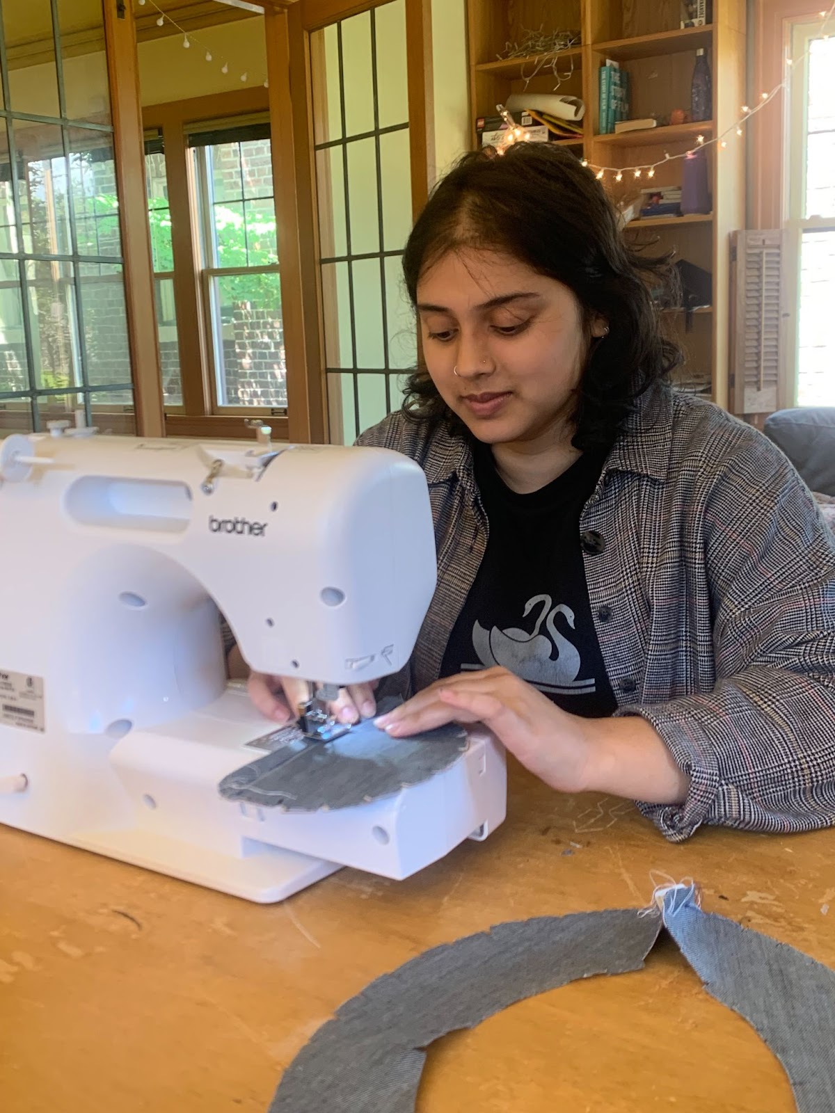
A test participant using the physical prototype. The participants were recruited from friend groups and were given a diary study to record their experience.
Lo-fidelity Prototypes: A proof of concept
Wireframes
Why?
Wireframes serve as the skeleton of our digital product. In order to take an iterative approach to building our platform, it was important for us to establish the basic structure of our website through wireframing. We can then test this structure before carrying the design further. Thus, we wanted to finish our wireframes and be ready for our next milestone which involves user testing and iteration. This way, any structural changes that need to be made after testing can be incorporated easily before moving to a higher fidelity iteration.
Physical Kit Prototype

To test the concept of our sewing kits, our DIY savvy team members reverse engineered a simple piece of clothing. The bucket hat. It featured a system of symbols for knowing which ends to sew together as well as a set of instructions and diagrams for the user to follow. Our overarching design goals were :


1) to create a seamless transition from the digital to physical experience.


2) to allow a novice sewing enthusiast to assemble a simple custom garment without significant obstacles


3) make the kits and DIY experience enjoyable, educational, and marketable.


This prototype was internally tested and then given to 3 participants.

A test participant using the physical prototype. The participants were recruited from friend groups and were given a diary study to record their experience.

Usability Testing: Figuring out what works

Guiding questions:
How easily can users discover and purchase a DIY sewing kit?
What obstacles do users encounter when navigating the Mosaic prototype?
What size customization options do users prefer?

Methods

Screening Questionnaire

Recruit target audiences relevant to Novoloom. Ensure participants represent a variety of different users.

Online Usability Test (via Maze

Allow for asynchronous testing without the presence of a team member. Gather a larger sample size that allows for collection of data like mouse click heatmaps, paths, and task completion time.

Post-Task Questionnaire

Evaluate the perceived difficulty of each task, understandability of the task, and other general task feedback.

Post-Test Questionnaire

Encourage participants to reflect on their overall experience with the website. Gather last-thoughts and also feedback on the test itself
Results & Recommendations

Mission 1: Find a DIY Shirt to Purchase

Problems

P1

"think the order of the tabs should be about - tutorial - kits"

P2

"Don’t understand the meaning of * count for time and difficulty."

P3

"was slightly confused when I tried to click the arrow next to “Kits” and it wasn’t clickable."

Problems

P1

"think the order of the tabs should be about - tutorial - kits"

P2

"Don’t understand the meaning of * count for time and difficulty."

P3

"was slightly confused when I tried to click the arrow next to “Kits” and it wasn’t clickable."

Design Recommendations

D1

Rearrange the menu bar to: About - Kit - Tutorials

D2

Come up with a more relatable system to describe Time and Difficulty

D3

Ensure Hi-Fidelity Mockup has hover states.

Mission 2: Sizing

Problems

P4

"I am not sure how accurate the results will be, and there is a chance that the size that it suggests may still not fit on me well"

P5

"I may have privacy concerns about sharing my image. Also, I am not sure if the precision of the measurement will be depending on what I am wearing at the moment"

P6

"I guess I am unsure of the accuracy of these types of scanning methods since I have never used an app that can measure body size accurately just from video or pictures? "

Design Recommendations

D4

Do through research on various fit quizzes to insure the accuracy of the Mosaic fit quiz

D5

Eliminate the body scanner option due to time constraints and apprehensions about privacy

D6

Add description for each type of measurement options instead of saying how long they will take/how difficult they are
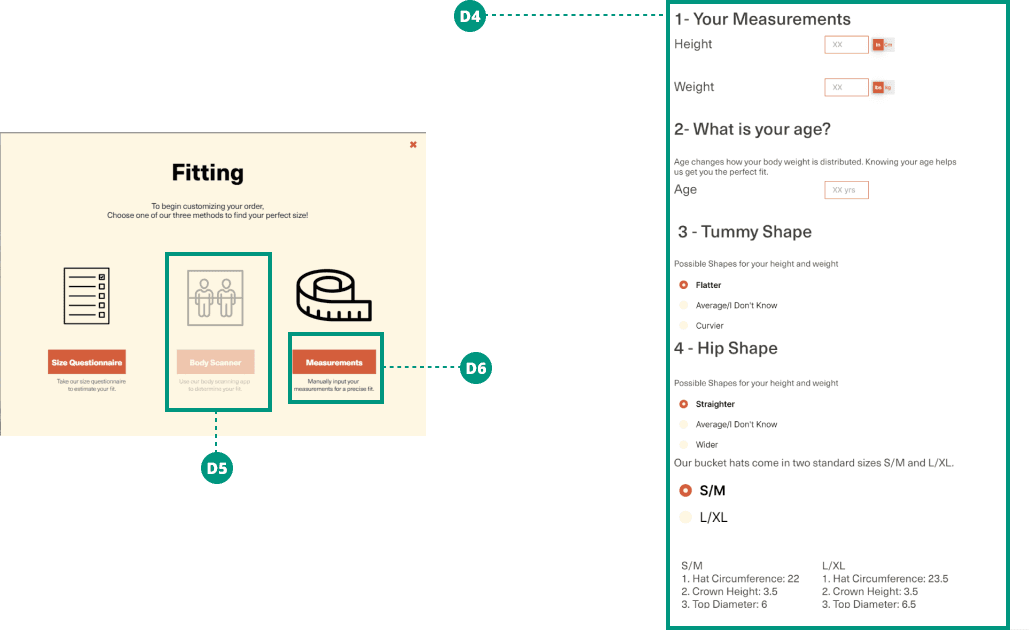
Mission 3: Input Custom Measurements
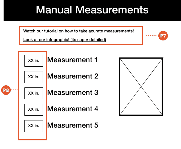
Problems

P7

"I thought I’d be referencing an image diagramming where the measures are referring to"

P8

"Maybe have an option to switch between in. and cm.?"

P9

"what’s the difference between save & exit vs add to bag? seems like add to bag would save & exit"

Design Recommendations

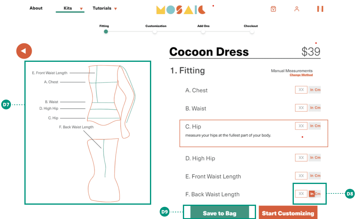
D7

Include a measurement guide/infographic to help users find their own measurements and input them into the manual measurement form

D8

Eliminate the body scanner option due to time constraints and apprehensions about privacy

D9

Add description for each type of measurement options instead of saying how long they will take/how difficult they are
Mission 4: Customize the look of a DIY Kit
Problems

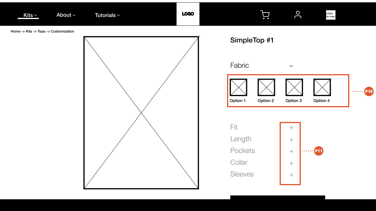
P10

"I’d like to edit from a template, rather than starting from scratch. As a visual buyer - typically I choose what I originally saw on the screen. So I’d expect that whatever is shown to me as the default, I wouldn’t modify by that much"

P11

"maybe with color button showed up to help people to know the next step would be helpful"

Design Recommendations

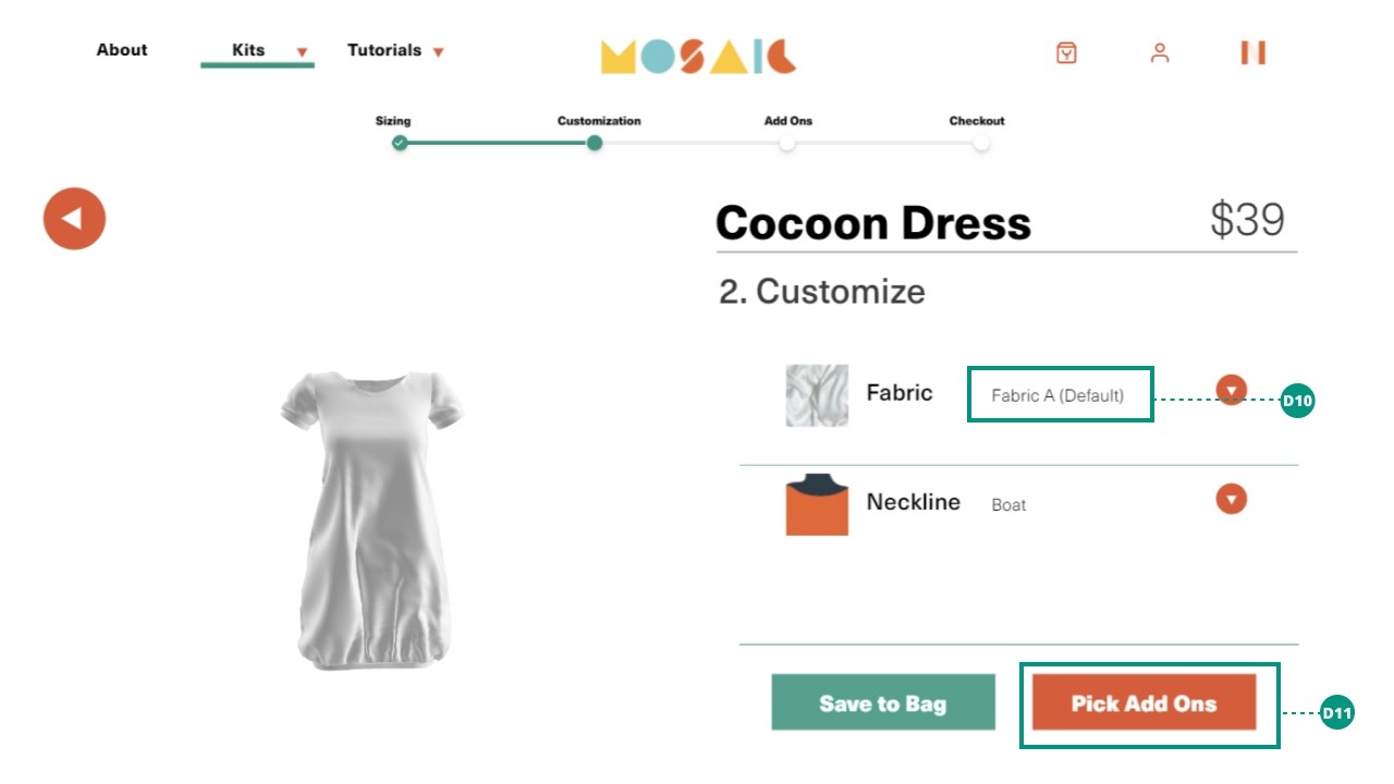
D10

Give users default options that they can customize if they want to.

D11

Keep customization optional and make button more descriptive as to what is the next step.
Final Deliverables
Reflection

Things that went well:

- Winner of the Engineering Award in the HCDE Capstone Showcase.

- Only team to finish with real products that can be shipped

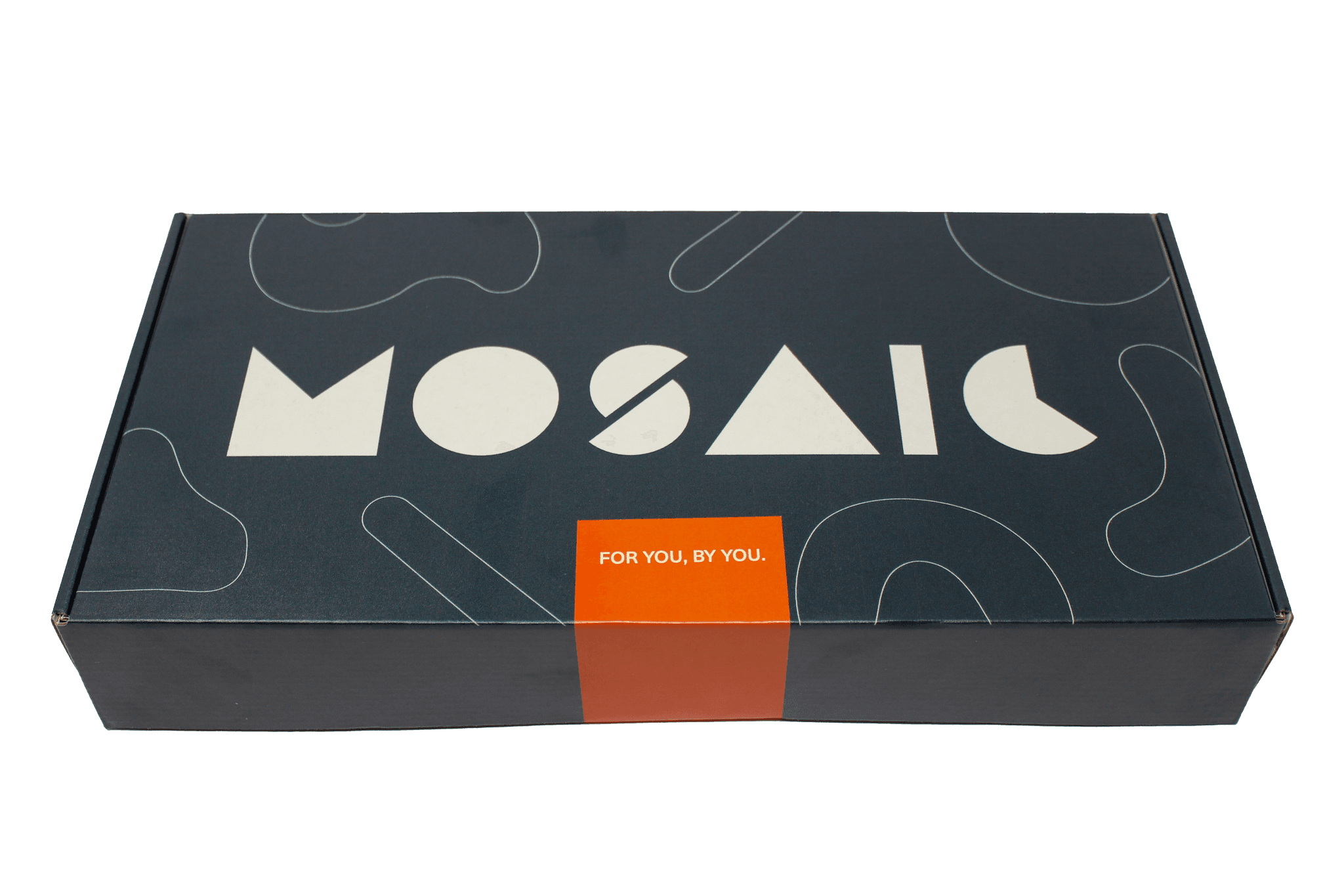
- Novoloom went on to retail the Mosaic kits. All 50 that were produced for the holidays, sold out.

- Branding, UI and design assets were very well received.

- Mosaic went on to win the Jones and Foster accelerator at the University of Washington.


Things to improve:

- Could have conducted more documented usability testing in the second round as our second round of feedback was informally received.

- More focus on accessibility including compliance with WCAG standards.

- Could have scoped the project better. Lots of things were worked on but ultimately did not make the cut. These included modifiable 3-D models, a way for users to save their measurements with an account, login flows
Problem
How do we reimagine fashion with regards to
sustainability and customizability?
Keep scrolling to find out
How do we reimagine fashion with regards to
sustainability and customizability?
Keep scrolling to find out